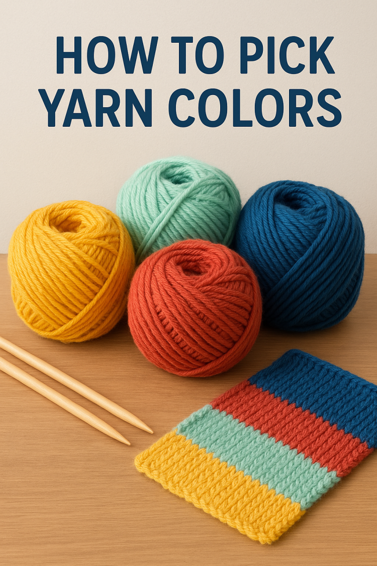
One of the trickiest roadblocks that most beginner knitters and crocheters will face is how to create a decent color palette. Let’s face it, we all have that one granny square blanket. That’s a little questionable at this point. That hideous thing is a rite of passage. We’ve all done it. But can we please just outgrow that awkward phase already? How do you actually get good at matching colors so you can be proud of the projects that you spend hours working on? Now, I could sit here and give you a crash course in color theory, but I have never seen anyone in a yarn store with a color wheel. So we’re going to skip past all those boring parts instead. Today, I am handing you the answers 10 foolproof color palette ideas for your next knit or crochet project. Hello, my loves.
Toni here from TL yarn crafts. And with over 200 designs in my pattern library, I’ve become known for my bright and bold color scheme. But trust me, it took me over a decade to learn what I’m going to give you in the next few minutes. So grab a pen, grab a notebook, and get comfy and make sure you stick around until the end. I asked some of my favorite color gurus for their tips, and they served up pure gold. I can’t wait to share it with you. Before we dive head first into all of this yarny goodness, I want to welcome back one of my absolute favorite video sponsors, skillshare. Skillshare is an online learning community for the curious kid inside of all of us.
They have a vast library of creative classes taught by the best of the best in art, tech, crafts, business and production. Now, I would need more fingers and toes to count all of the skillshare classes that I’ve taken, but there are a few that I keep coming back to over and over again. Namely, Knitting 101, taught by one of my great friends, Vincent Williams. In just an hour and a half, Vincent will help you build a foundation of what knitting is and how to do it comfortably. Now, I took Vincent’s class just over a year ago, and I’m proud to share that I am knitting my very first sweater. She still has a long way to go, but by learning how to cast on knit, Purl, cast off, I’ve built the confidence to move into other types of knitwear pieces.
I really never thought that I would get here. I thought I was going to be a lifelong crocheter and that’s it. But Vincent is such a great teacher. He’s very gentle, but very knowledgeable and it really helped it all sink in for me. Now if there is a skill or a talent that you are looking to unlock, skillshare has the class for you. The platform is designed to help you build creativity into your life by learning directly from real, super talented and successful creatives. And right now the first 500 people to use the link that’s down in my description or to scan this QR code right here will receive a one month free trial to skillshare. Go ahead and get started and thank you so much to skillshare for sponsoring this video.
And while we’re at it, let’s give some love to our cup of Caffeine sponsor. Now I had no business buying any more ceramic mugs while I was at DFW Fiber Fest, but they are my weakness and I could not deny this one from Hun Bun Ceramics. Big thank you to Sharon and her boo Thang for gifting this to me. Thanks y’. All. Now today’s cup of Caffeine sponsor is Amber 33.991. And when donating, Amber said, hey Tony, I recently got into crochet. In fact, all I can make are potholders, but I’ve made a lot of them in the last few weeks but want to learn and do so much more. Your videos are so inspirational. Amber. You are at the perfect spot in your journey. Tackle everything, Learn everything. I am so excited to see what crochet is going to open up for you.
Now. If you like my videos and want to support my channel, buy me a coffee. Who knows, I might shout out the next one. Now let’s talk color palettes. We’re going to start things off nice and simple with our first color palette, which is just two neutrals and a pastel. So first I’m going to grab my two neutrals here. I have this nice soft cream and kind of like a mousy brown color. From here I can bring in my pastels and your pastel is just going to be a solid color that you then added white to. So my first pastel I’m playing with is this nice pink. When I add that to the palette, it gives you that classic kind of baby girl blanket nursery type of feel.
If pink is not so much your jam, you can take that out and add in any other pastel. I just happen to have kind of this tealish blue green here. And once again we have this soothing, relaxing palette that looks really stunning together. Now I have tons of yarn in my stash, so I built some palettes with Some other colors as well. Here I have, again, a nice, bright whitish cream. And then I have this soft brown here. If I wanted to add some pastels here, I could also do a pink. And even with a stronger brown, this still makes total sense. Or I can take out that pink and put in a soft blue. And I think this really looks lovely. It reminds me of plaid and teddy bears and cute little boy Stu.
Now, let’s say this is all a little bit too cutesy for you. You might be interested in palette number two, which is two neutrals and a bright. So if we take it back to our original palette here, we’re going to take out this blue, and we’re going to add in a stronger version of that. Now, this isn’t really bright, but it is a whole lot bolder. So this adds a lot more depth to the palette, takes it away from some of those baby colors we’ve been playing with. And this feels very appropriate for an adult. We can also take this color out and throw in a stronger version of pink. And again, we still have something that is neutral, that is soothing, but we have a little bit of a stronger color here.
And with this type of palette, too, we can add that color back in. And now we have a beautiful bit of balance with some bolder colors and some neutral colors. For palette number three, we’re going to move into monochrome pairs. Now, these are color palettes where you take the same hue or the same color, and we’re going to play around with value. So value is going to be how light or. Or dark that color is. So take your favorite color, red, green, orange, blue, and then grab a light color or a dark color from that same family. So here in my examples, I pulled this lovely red color along with pink. So we have a lighter value, so a lighter reddish color and a deeper value, so a darker reddish color.
The blend of this soft color and this bold color creates a lot of depth in your color palettes, but it still makes sure things feel very cohesive. So this is what I did with a bit of red, but with another yarn, I did the same with purples. So I have kind of this medium tone purple, and then I have this much deeper purple. Absolutely stunning together. And we also pull in kind of some raspberry reddish notes here. So again, lots of depth, lots of character, but still cohesive. So let’s say you like this idea of a monochrome pair, but it’s all feeling a little bit colorful for you. You’re looking for some negative space or some place for your eyes to take a rest.
That is a good chance for you to dive in to color palette number four, which is monochrome pairs, and add a neut. So while we have two very lovely colors going on in this palette with this brighter red and this softer pink, the addition of this gingerbread brown gives us a lot of depth and character in our palette. We can do the same thing with our purple palette as well. I’m just going to scoot this to the side, bring my two purples back in, and then the addition of this nice soft brown tan color, again gives a lot of depth and also is like an exhale. You get to relax a little bit. There’s this other element in the palette that makes it very soothing, relaxing, and neutral.
Let’s move on to color palette number five, which I like to call three shades, one family. So this is when you choose your favorite color out of the rainbow and then just pick three colors within that same color family to create a beautifully cohesive palette. This really expands on a previous color palette we talked about, which was the monochrome pair. I really like to pick two colors that feel like they go super well together, and then choose a third somewhat wacky, bright, or out there color to really elevate the palette. So let’s see some examples. So first, I have this beautiful pair of greens. I think green is a lovely chance to play around with color because there are so many different shades and values that happen within the green color scheme.
So we have a nice earthy, deep, grassy green, and we have a nice, bright, minty green. And for my third color, I wanted to think a little bit out of the box. So I’m pulling in this really nice, like, kind of citron green. So it’s definitely off the beaten path of these other two colors that went to. But since it’s still in that green family, it should pair really well with these. So now we’ve had a little bit of playtime with the greens. Let’s move it over and play around with some blues. In this case, I have some little mini skeins. I’ve got a deep navy blue and this nice kind of icy blue. And to this palette, I’m going to add this ultraviolet blue, this really nice, bold color, to add some shock and some awe to this palette.
But that cohesion of choosing from the same hue should still make it a very pleasing palette in your project. Our color palette number six is going to be a variation on your primary colors. Now, back in school, I learned that my primary Colors were red, yellow, and blue. But when it comes to building a color palette for your knit and crochet projects, consider skipping those classic primary colors, which can feel a bit like walking into a second grade classroom. Instead, either look for softer or more edgy versions of this color palette that’s going to add some sophistication to your palette, while also taking advantage of this tried and true color theory combination. So let me show you a few examples. So, first, I have this combination right here.
This I absolutely love, and I feel like this is my happy place when it comes to color palettes. So we have our red, our blue, and our yellow, our primary colors, but you can see that they’re a little bit off center. We’ve gone to kind of like a dusty or boho feel to these colors. So you can use your favorite area of inspiration to still build a palette that follows these color theory rules. On the other end of the spectrum, I have one that is a bit on the brighter side, and that’s right here. So we still have the red, the yellow, and the blue, but you can see went super duper bright on that red, really bold on that yellow, and a bit softer on that blue.
So still following those color theory rules, but again, taking an opportunity to infuse your own personality. Got it. Good. Let’s move on to the next palette. Our next color group is variegated palettes Made Easy. Now, I know that you have been in a yarn store before and seen a beautiful variegated skein of yarn and wondered what the heck to do with it. Well, the first thing to do is to make it in a cohesive palette so you can put it into your project. I like to use that variegated skein as kind of my hero color. Right. It’s the main color at the center of my project. From there, I like to choose a color that is in that variegated palette to then pull out into its own solid or tonal.
And finally, you can add in a neutral, and that’s going to bring some sophistication and some balance to your palette and also give your eyes somewhere to rest. So let’s put it to the test. First, I have this lovely skein of variegated yarn. Inside here we have some lovely pinks, some purple tones, oranges, greens. So for my solid color, I’m going to pull out that purple. I chose to go with purple because while there’s some in there’s not a whole lot. And I think it would be fun to draw your Eye more to that color in this palette. And then as far as the neutral, this overall has a very light feel to it, so I’m going to add a light neutral to balance this out. You could go with a darker neutral as well if you needed a bit more contrast.
This is a pretty low contrast palette, and I think it looks absolutely fantastic. Now, if you don’t want things on the light side, we can always go a little bit deeper, like we did here with this hue. Loco skein, which got these lovely neutrals in there. We’ got some deep teal colors, also some terracottas, orange, rose colors. There’s lots of beautiful shades in here. Since I want to keep things kind of on the moodier side, I’m going to pull up this navy even more with this tonal skein right here. And then to balance things out, I’m going to bring in this smoky brownish gray. So you can see that we now have a whole lot of character in this palette.
We’ve gone a lot deeper than our last one, but still using the same rules of pulling out a color for your tonal and also adding in a coordinating neutral. I don’t know about y’, all, but all these color palettes are giving me a lot of ideas for projects I don’t have time to make, so let’s keep it moving. For color palette number eight, we are looking at complementary pairs. Now, complementary colors exist on opposite sides of the color wheel, giving them a natural contrast and adding a delightful bit of pop to your knit and crochet color palettes. Now, I personally tend to go for softer versions of these colors, because when you go with the deeper or heavier colors, it seems to feel like they’re a little too two at odds. Let me show you an example.
So purple and yellow exist on opposite sides of the color wheel, and what I’ve done with this palette here is pulled in a nice lavender purple, and I’ve paired it with this kind of honeyed gold yellow color. So these do have a natural bit of contrast, and I think they create an absolutely stunning color palette without being too strong or feeling too at odds with one another. Here comes another example. This time I’m pairing orange and blue, but not in a way that might be super well expected. Instead, I’m going with a coral color paired up with a turquoise. Now that we have our complementary pairs going on, we can always balance out the palette with the neutral. In this case, I’m going to put. I think I’m going to put this soft gray with my orange blue.
Palette, and I’m going to put this really creamy white with my lavender and gold palette. And you can see that adding in that neutral just gives a little bit more depth, a little bit more character to each of our palettes and also gives our eyes somewhere to rest. I tell you what, you master your neutrals, and you’ll be making color palettes in no time. For color palette number nine, we’re getting into a really fun one, which is a gradient ombre. To achieve this palette, you’re going to work from light to dark across one hue or one color, slowly adjusting the value from one skein to the next. Now, this works super well over one color, but you can do multiple colors. Let me show you some examples.
So here I have several packets of mini skeins, which I think are some of the easiest ways to create a gradient without scratching your head and sorting it out on your own. So first and foremost, here is one that is worked over one hue. We’re just working in our grays, so we’re going from a deeper value all the way up to a lighter one. And then it kind of switches up a little bit here at the end, but it’s still cohesive with the rest of the palette. All these colors came in a pack together, and I will never break them up until it’s time to use them in one single project. So that is a gradient over the same hue. And here I have one that is worked over two hues.
You can see that we’re moving from this lovely purple across to red, so we have adjustments to the value as well as the hue in between, and these work really well together. And lastly, we have another gradient, and this one is incorporating multiple hues, so we’re moving through reds, yellows, as well as oranges. These colors are all right next to each other on the color wheels, so we have a nice cohesive ombre moment going on. But you can see we can play around a little bit with those different hues and values to make something a little more unexpected. And last but not least, our final color palette is going to be black plus white plus an acc. One of the markers of a great knit or crochet color palette is going to be contrast.
That’s going to be the push and pull between the colors that guide your eye to different places within the project. So having black and white, which have natural contrast, is already going to give you a really stunning and stark look to your project. Then you can think about adding additional colors. If we take it all the way back to the beginning we had two neutrals and a pastel or two neutrals and a pop. And you can use those same ideas here. So these will act as our two neutrals. And if I want to add in a pastel like this soft blue, it really does soften the palette. Now, on the other end of the spectrum, if you need something a little brighter, bolder, more unexpected, I’ve got this hot pink. And oh, boy, we’ve got contrast in spades here. This palette feels graphic.
It feels very look at me. And it really is going to draw attention when you walk into a room. Now, both of these color palettes are going to jump out in your project, so you really just have to decide how bold you want to be. Now, these are just 10 color palettes to get you started. Now, once you get a little bit more experience building palettes, you can begin thinking outside of the box, drawing inspirations from your closet or from nature or from some of your favorite yarn dyers. I personally like to use websites like Coolors and Canva, both of which I’ve linked down in the description.
Not only do both of these platforms allow you to build color palettes from photo inspiration, they’re going to give you trending color palettes to pull from and help you build custom color palettes with a palette generator. Just be careful and don’t fall down the color rabbit hole like I do every single time I go to these sites. Now, before we wrap up, I want to leave you with some wisdom straight from the color gurus. These are three fantastic yarn dyers who live and breathe color every single day. First, we have Adela from Lola Bean Yarn Co, who reminds us that color is personal. She chooses shades based on her mood. Calm days draw her to grounded fall inspired tones like burgundy and burnt orange, while high moments push her towards bright pops and speckles.
She also urges us to look to nature as the ultimate palette maker. Snapping a photo of a sunset, a flower bed, or even a bird’s feather can give you a perfectly balanced, effortless palette to start with. And if you’re feeling adventurous, she suggests trying teal hot pink and golden yellow together, A combo that’s bold, joyful, and a little unexpected. Next, we have Nicole from Hue Loco, who takes more of a design driven approach. Her biggest tip is to let the pattern itself lead the way. Busy textures shine with solids and tonals, while simpler fabrics can handle wilder colors. She also stresses the importance of contrast in value. Light versus dark, because that’s what makes your stitches pop. And when you’re ready to experiment. Nicole encourages starting small with low commitment projects that you can play freely without the pressure of ruining your expensive yarn.
Her underrated favorite? Hot pink paired with a deep, vibrant blue. It takes a color combo we usually think of as baby blanket and gives it a fresh, sophisticated energy. And finally, we have Ashley of Sorella, who starts every palette with what she calls hero color, the color she can’t stop thinking about. From there she builds, maybe adding a contrasting color for depth, a complimentary sister shade for harmony, a neutral to let the eye rest, or anchor tone for weight. If she’s feeling playful, she throws in a wild card, something that shouldn’t work like a neon with pastels shells, but just might become a new favorite. Ashley also reminds us that no one is born good at color.
Just like crochet, it’s a skill that you build by practicing, observing and noticing what inspires you, whether it’s at the farmer’s market, a fashion Runway, or your kids crayon box. So whether you follow your mood, focus on the pattern, or start with a hero color, the message is the same color is placed play. We all learn by trying, failing and trying again. And in the end, the best palette is the one that makes you want to pick up your hook and keep on stitching. I really hope you’re walking away from this video feeling encouraged and inspired to try some different things when it comes to color in your knit and crochet projects. And if you’re feeling brave, drop down into the comments and let us know some of your color triumphs and triggers.
Personally, I’ve had an ongoing struggle with the color purple, but she and I are really warming to each other and I’m excited to incorporate that into more of my fall makes. If you enjoyed this video or learned anything at all, please give it a like and consider subscribing to my channel. I am this close to a million subs and I really need your help getting there. And thank you so much for watching. And until next time, I’m Toni Happy stitching. Loves. Bye.